Two Buses. One Future.
Picture this: two buses idling at the design station.
One glints with the infinite promise of AI — fast, scalable, and dangerously close to perfect. The other is rooted in sustainability — tactile, deliberate, human. Both are packed with ideas. Both are heading into the future of branding.
Which one are you boarding?

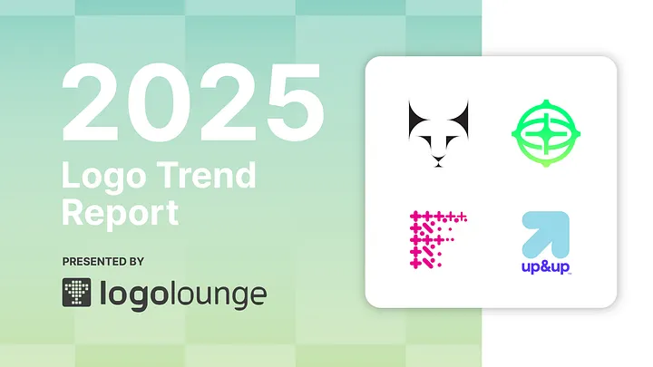
The 23rd LogoLounge Trend Report
For more than two decades, the LogoLounge Trend Report has been the branding industry’s radar — identifying and naming design movements as they emerge. This year, after studying over 30,000 logos from more than 120 countries, one truth is clear:
Trends aren’t fads. They’re forces.
They reveal how design reacts to culture, tech, and the way we connect.
And in 2025, the contrast is sharper than ever:
- On one side: logos built for micro-screens — vibrant, clean, and fast-moving.
- On the other: logos grounded in craft — muted palettes, warm textures, and analog charm.
Designers are walking the tightrope between extremes — and often, doing it beautifully.
Don’t Follow Trends. Understand Them.
A reminder for every designer reading this:
Trends are not templates. They’re fuel. They’re reference points that show how visual language is evolving — and your job is to push it further, not copy it.
With that in mind, let’s dive into the seven key logo trends rising in 2025 — with even more waiting at the link below.
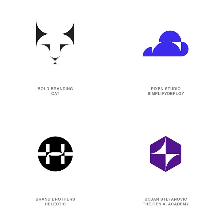
🔪 Sharps
Precision cuts. Visual tension. Tactical rebellion.
Gone are the days when harsh angles were considered too aggressive for logos. Today, razor-sharp terminations and deep slices are used intentionally to create friction and energy. These marks suggest precision, control, and a daring brand personality.
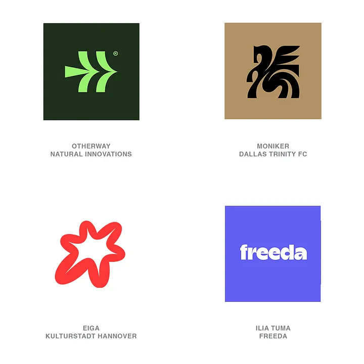
🌲 Smokies
Soft, warm, and nostalgia-infused — but make it digital.
Inspired by routed wood signs and national park aesthetics, Smokies bring a sense of familiarity and comfort. With modern smoothing and digital polish, these logos feel both friendly and quietly confident.
✴️ Coves
The quartered star is shining bright.
The dazzle-star (a shape often created by quartering a star or diamond) is popping up in icons and typography alike. It plays on visual completion — our brain wants to fill in the gaps. These designs feel dynamic and interactive, encouraging engagement.
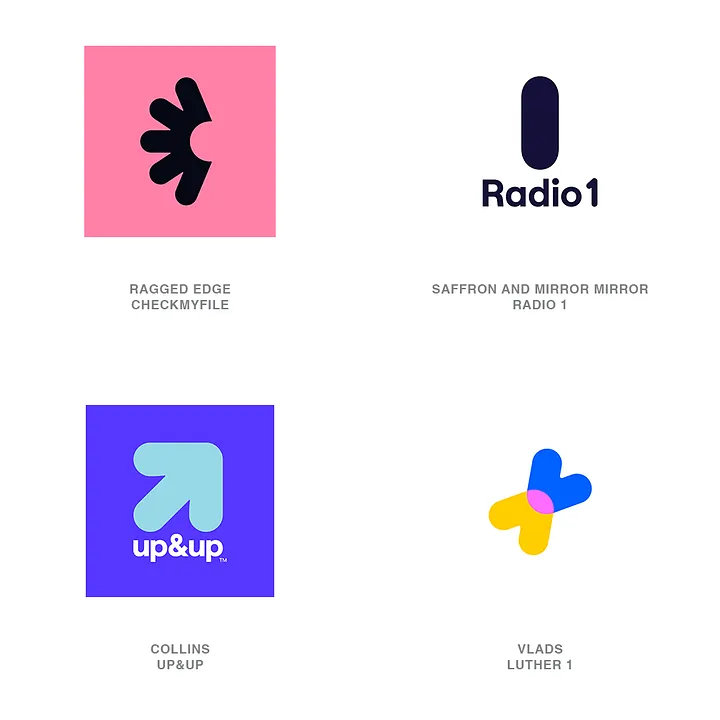
📈 Scalers
Logos that grow, expand, and evolve — visually.
Using step patterns, radiating shapes, or scaling sequences, these marks create a rhythmic sense of motion. They’re perfect for brands that want to suggest progress, innovation, and momentum.
🌀 Crossovers
Fluidity, agility, and layered meaning.
Ribbon-like elements overlap and interweave to create dimensional logos. These marks convey movement, complexity, and evolution, while still feeling balanced and clean. A great fit for brands embracing change.
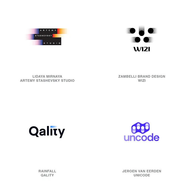
💨 BlurTails
Still logos with speed built in.
These logos look like they just moved. Gradient trails and directional fades imply speed, motion, and transformation — perfect for brands that want to appear cutting-edge, fast-paced, or futuristic.
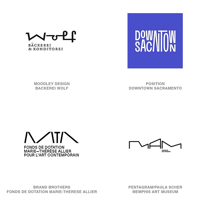
🏗️ LongLegs
Typography as architecture.
Extra-tall letterforms, extended stems, and architectural exaggeration give logos a bold presence. These playful but calculated distortions invite you to read a little longer — and remember a little more.
This Is Just the Start.
We’re tracking 15 logo trends in 2025 — each one helping to map out how design is reacting to the cultural push and pull between machine and maker, speed and soul.